The anatomy of an Amazon listing image that converts
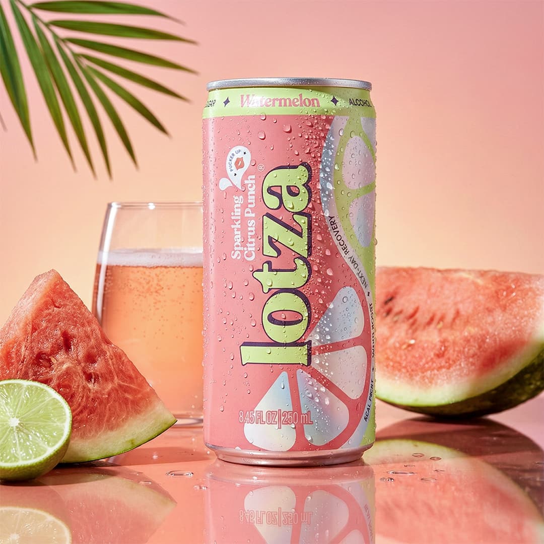
On a marketplace, the image does the selling before a single word is read. Shoppers scan a grid of thumbnails, and the picture decides whether yours earns the tap. Each image slot has a distinct job: treat them the same and you waste most of them.
01The main image earns the click
Clean, well-lit, product filling most of the frame, no clutter competing for attention. This is the thumbnail in search results, so it has to read at a fraction of its full size. If it doesn't survive being shrunk to a stamp, it isn't finished.
02The gallery answers objections
Every following image should retire a doubt: scale next to a hand or a familiar object, texture up close, what's in the box, how it's used, the result. Think of the gallery as a silent FAQ told in pictures.
03A+ content builds the world
This is where lifestyle and brand story belong: the mood, the values, the context a bare product shot can't carry. It's the difference between a listing that sells a unit and one that sells a brand.
04The mistakes that cost the click
Busy main images, illegible text baked too small, inconsistent colour across the gallery, and a single ratio stretched to fit every slot. Consistency and legibility beat cleverness on a marketplace, every time.
Bring us your next product.
Send one product shot, and we handle research, direction, production and delivery.